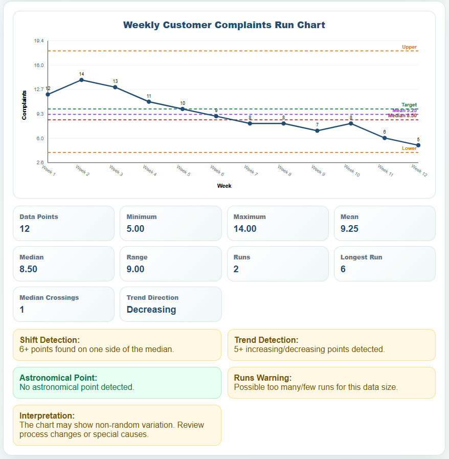
A Run Chart is a line graph used to display measurements in time order so changes, patterns, and variation can be reviewed over a sequence of observations. It is commonly used for process monitoring, quality improvement, operational tracking, service performance, and other situations where values are recorded over time.
The generator below lets you enter or paste labels/dates, measurement values, and notes and automatically creates a run chart. The chart uses a median reference line by default and can optionally display a mean line, target value, or user-defined upper and lower reference values.
The tool also provides descriptive statistics and basic screening for possible shift and trend patterns. These checks are intended to help review the sequence of observations; they do not by themselves identify the cause of a change or replace a formal statistical analysis. The completed chart can be printed or saved as an A4 landscape PDF and can also be exported as PNG, SVG, or CSV.
Run Chart Generator v1.1.2
Create a time-ordered run chart with a median reference line, descriptive statistics, and basic pattern screening.
Chart Settings
Paste CSV or Excel Data
Observations
| # | Label / Date | Value | Note |
|---|
Run Chart
Enter observations to build the chart.
Frequently Asked Questions
What is a run chart?
A run chart is a line graph that displays measurements in the order in which they occurred. It helps users visually review changes and patterns in data over time.
Why does the generator use a median line?
The median provides a reference for comparing observations above and below the middle of the dataset. The Run Chart Generator displays the median line by default, while the mean line can be enabled optionally.
What is a shift pattern in a run chart?
In this generator, a possible shift pattern is indicated when six or more consecutive non-median observations appear on the same side of the median. This is a screening indicator and does not by itself establish the cause of a change.
What is a trend pattern in a run chart?
The generator indicates a possible trend when five or more consecutive observations increase or decrease in one direction. The result should be considered together with knowledge of the process and relevant events.
Are the upper and lower reference values control limits?
No. The Upper Reference Value and Lower Reference Value are optional values entered by the user for visual comparison. They are not statistically calculated control limits.
What is the difference between a run chart and a control chart?
A run chart displays measurements in time order and can use a median line to help review patterns. A control chart applies a statistical method to calculate appropriate control limits. This Run Chart Generator does not calculate statistical control limits.
How many observations do I need for a run chart?
There is no single number that is appropriate for every use. A run chart becomes more informative as enough sequential observations are collected to evaluate behavior over time. Very small datasets provide limited information for pattern screening.
Can I paste data from Excel into the generator?
Yes. You can paste sequential data into the Paste CSV or Excel Data area using the Label/Date, Value, Note structure and apply it to the chart.
What statistics does the generator calculate?
The generator summarizes the number of observations, minimum, maximum, median, mean, range, number of runs, and latest measurement.
Can I download my run chart?
Yes. The completed chart can be exported as PNG or SVG, and the underlying chart data can be downloaded as a CSV file.
Can I print or save the run chart as a PDF?
Yes. Use Print / Save PDF in the Live Preview section to produce the formatted A4 landscape report or save it as a PDF through your browser's print options.
Using the Run Chart Generator
Enter observations in the order in which they occurred. Each row can contain a label or date, numeric value, and optional note. You can also paste rows copied from a spreadsheet in the format Label/Date, Value, Note.
The generator recalculates the median and other descriptive statistics as the data changes. The Median Line is enabled by default. Optional target and upper/lower reference values are user-defined guides and should not be interpreted as statistical control limits.
Use Load Sample only to view an example dataset. Use Reset to return to a blank chart.
The downloadable Run Chart Excel Template provides a spreadsheet-based alternative for recording measurements and reviewing values over time. It can be useful when you want to retain the underlying data in Excel, modify the worksheet, or incorporate the observations into an existing reporting workflow.
File: Excel (.xlsx) and iPad
Size 26 KB
How to Read a Run Chart
A run chart plots measurements in the order in which they were recorded. The horizontal axis normally represents time, date, sequence, batch, week, or another ordered period, while the vertical axis represents the measured value.
Connecting the observations with a line makes it easier to see how the process changes over time. A run chart can be used to look for sustained movement, changes in level, recurring patterns, or unusual observations that may deserve further investigation.
The generator uses the median as the primary center line. The median is the middle value when the observations are arranged from lowest to highest. If there is an even number of observations, the median is calculated from the two middle values.
Shift and Trend Patterns
The generator includes two basic pattern-screening checks.
A possible shift pattern is indicated when six or more consecutive non-median observations appear on the same side of the median.
A possible trend pattern is indicated when five or more consecutive observations increase or decrease in one direction.
These indicators are screening aids. A detected pattern does not establish why the process changed, and the absence of a detected pattern does not prove that the process is stable. Results should be interpreted together with knowledge of the process and relevant events.
Target and Reference Values
A target value can be added when there is a goal, benchmark, specification, or other value you want to compare with the observations.
The optional Upper Reference Value and Lower Reference Value provide additional visual guides. These values are entered by the user and are not automatically calculated statistical control limits.
If statistical control limits are required, a suitable control-chart method should be used instead.
Run Chart vs. Control Chart
A run chart displays observations in time order and commonly uses a median line to help review patterns in the data.
A control chart goes further by applying a statistical method to calculate a center line and control limits appropriate to the type of data and process being monitored.
The Run Chart Generator on this page does not calculate statistical control limits. Its optional target and reference lines are user-entered comparison values.
Descriptive Statistics
Along with the chart, the generator summarizes values such as the number of observations, minimum, maximum, median, mean, range, number of runs, and latest measurement.
These statistics provide additional context for the displayed sequence but should be considered together with the chart itself. The time order of the observations is an important part of run-chart interpretation.